James A. Rising

Entries categorized as ‘Research’

Improving IAMs: From problems to priorities

January 9, 2019 · Leave a Comment

I wrote this up over the holidays, to feed into some discussions about the failings of integrated assessment models (IAMs). IAMs have long been the point at which climate science (in a simplistic form), economics (in a fanciful form), and policy (beyond what they deserve) meet. I’m a big believer in the potential of models to bring those three together, and the hard work of improving them will be a big part of my career (see also my EAERE newsletter piece). The point of this document is to highlight some progress that’s being made, and the next steps that are needed. Thanks to D. Anthoff and F. Moore for many of the citations.


Integrated assessment models fail to accurately represent the full risks of climate change. This document outlines the challenges (section 1), recent research and progress (section 2), and priorities to develop the next generation of IAMs.

1. Problems with the IAMs and existing challenges

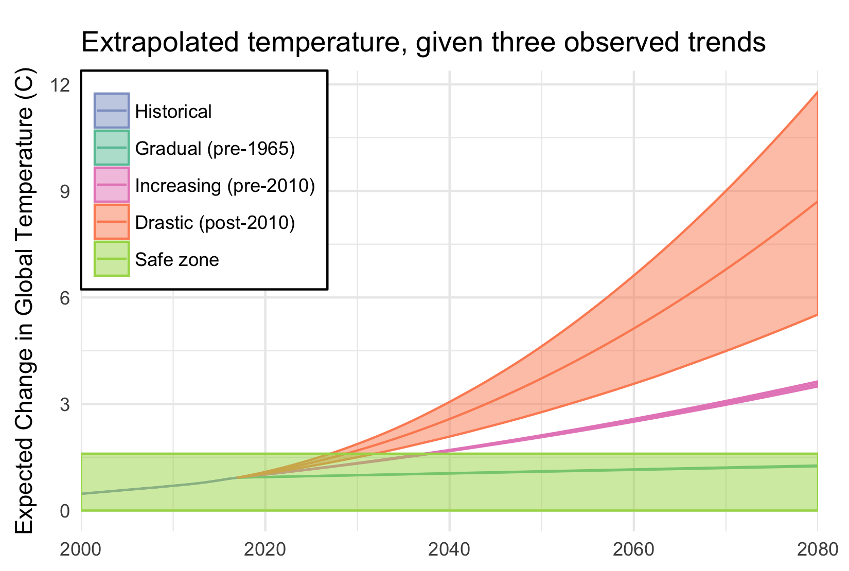
The problems with IAMs have been extensively discussed elsewhere (Stern 2013, Pindyck 2017). The purpose here is to highlight those challenges that are responsive to changes in near-term research priorities. I think there are three categories: scientific deficiencies, tipping points and feedbacks, and disciplinary mismatches. The calibrations of the IAMs are often decades out of date (Rising 2018) and represent empirical methods which are no longer credible (e.g. Huber et al. 2017). The IAMs also miss the potential and consequences of catastrophic feedback in both the climate and social systems, and the corresponding long-tails of risk. Difficulties in communication between natural scientists, economists, and modelers have stalled the scientific process (see previous document, Juan-Carlos et al. WP).

2. Recent work to improve IAMs

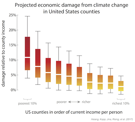
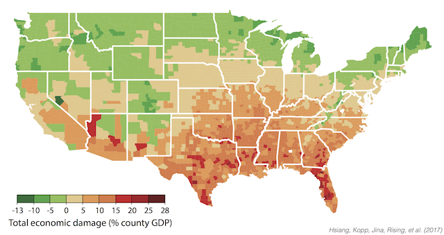
Progress is being made on each of these three fronts. A new set of scientific standards represents the environmental economic consensus (Hsiang et al. 2017). The gap between empirical economics and IAMs has been bridged by, e.g., the works of the Climate Impact Lab, through empirically-estimated damage functions, with work on impacts on mortality, energy demand, agricultural production, labour productivity, and inter-group conflict (CIL 2018). Empirical estimates of the costs and potential of adaptation have also been developed (Carleton et al. 2018). Updated results have been integrated into IAMs for economic growth (Moore & Diaz 2015), agricultural productivity (Moore et al. 2017), and mortality (Vasquez WP), resulting in large SCC changes.

The natural science work on tipping points suggest some stylized results: multiple tipping points are already at risk of being triggered, and tipping points are interdependent, but known feedbacks are weak and may take centuries to unfold (O’Neill et al. 2017, Steffen et al. 2018, Kopp et al. 2016). Within IAMs, treatment of tipping points has been at the DICE-theory interface (Lemoine and Traeger 2016, Cai et al. 2016), and feedbacks through higher climate sensitivities (Ceronsky et al. 2005, Nordhaus 2018). Separately, there are feedbacks and tipping points in the economic systems, but only some of these have been studied: capital formation feedbacks (Houser et al. 2015), growth rate effects (Burke et al. 2015), and conflict feedbacks (Rising WP).

Interdisciplinary groups remain rare. The US National Academy of Sciences has produced suggestions on needed improvements, as part of the Social Cost of Carbon estimation process (NAS 2016). Resources For the Future is engaged in a multi-pronged project to implement these changes. This work is partly built upon the recent open-sourcing of RICE, PAGE, and FUND under a common modeling framework (Moore et al. 2018). The Climate Impact Lab is pioneering better connections between climate science and empirical economics. The ISIMIP process has improved standards for models, mainly in process models at the social-environment interface.

Since the development of the original IAMs, a wide variety of sector-specific impact, adaptation, and mitigation models have been developed (see ISIMIP), alternative IAMs (WITCH, REMIND, MERGE, GCAM, GIAM, ICAM), as well as integrated earth system models (MIT IGSM, IMAGE). The latter often include no mitigation, but mitigation is an area that I am not highlighting in this document, because of the longer research agenda needed. The IAM Consortium and Snowmass conferences are important points of contact across these models.

3. Priorities for new developments

Of the three challenges, I think that significant progress in improving the science within IAMs is occurring and the path forward is clear. The need to incorporate tipping points into IAMs is being undermined by (1) a lack of clear science, (2) difficulties in bridging the climate-economic-model cultures, and (3) methods of understanding long-term long-tail risks. Of these, (1) is being actively worked on the climate side, but clarity is not expected soon; economic tipping points need much more work. A process for (2) will require the repeated, collaboration-focused covening of researchers engaged in all aspects of the problem (see Bob Ward’s proposal). Concerning (3), the focus on cost-benefit analysis may poorly represent the relevant ethical choices, even under an accurate representation of tipping points, due to their long time horizon (under Ramsey discounting), and low probabilities. Alternatives are available (e.g., Watkiss & Downing 2008), but common norms are needed.

References:

Burke, M., Hsiang, S. M., & Miguel, E. (2015). Global non-linear effect of temperature on economic production. Nature, 527(7577), 235.
Cai, Y., Lenton, T. M., & Lontzek, T. S. (2016). Risk of multiple interacting tipping points should encourage rapid CO 2 emission reduction. Nature Climate Change, 6(5), 520.
Ceronsky, M., Anthoff, D., Hepburn, C., & Tol, R. S. (2005). Checking the price tag on catastrophe: the social cost of carbon under non-linear climate response. Climatic Change.
CIL (2018). Climate Impact Lab website: Our approach. Accessible at http://www.impactlab.org/our-approach/.
Houser, T., Hsiang, S., Kopp, R., & Larsen, K. (2015). Economic risks of climate change: an American prospectus. Columbia University Press.
Huber, V., Ibarreta, D., & Frieler, K. (2017). Cold-and heat-related mortality: a cautionary note on current damage functions with net benefits from climate change. Climatic change, 142(3-4), 407-418.
Kopp, R. E., Shwom, R. L., Wagner, G., & Yuan, J. (2016). Tipping elements and climate–economic shocks: Pathways toward integrated assessment. Earth’s Future, 4(8), 346-372.
Lemoine, D., & Traeger, C. P. (2016). Economics of tipping the climate dominoes. Nature Climate Change, 6(5), 514.
Moore, F. C., & Diaz, D. B. (2015). Temperature impacts on economic growth warrant stringent mitigation policy. Nature Climate Change, 5(2), 127.
Moore, F. C., Baldos, U., Hertel, T., & Diaz, D. (2017). New science of climate change impacts on agriculture implies higher social cost of carbon. Nature Communications, 8(1), 1607.
NAS (2016). Assessing Approaches to Updating the Social Cost of Carbon. Accessible at http://sites.nationalacademies.org/DBASSE/BECS/CurrentProjects/DBASSE_167526
Nordhaus, W. D. (2018). Global Melting? The Economics of Disintegration of the Greenland Ice Sheet (No. w24640). National Bureau of Economic Research.
O’Neill, B. C., Oppenheimer, M., Warren, R., Hallegatte, S., Kopp, R. E., Pörtner, H. O., … & Mach, K. J. (2017). IPCC reasons for concern regarding climate change risks. Nature Climate Change, 7(1), 28.
Pindyck, R. S. (2017). The use and misuse of models for climate policy. Review of Environmental Economics and Policy, 11(1), 100-114.
Rising, J. (2018). The Future Of The Cost Of Climate Change. EAERE Newsletter. Accessible at https://www.climateforesight.eu/global-policy/the-future-of-the-cost-of-climate-change/
Steffen, W., Rockström, J., Richardson, K., Lenton, T. M., Folke, C., Liverman, D., … & Donges, J. F. (2018). Trajectories of the Earth System in the Anthropocene. Proceedings of the National Academy of Sciences, 115(33), 8252-8259.
Stern, N. (2013). The structure of economic modeling of the potential impacts of climate change: grafting gross underestimation of risk onto already narrow science models. Journal of Economic Literature, 51(3), 838-59.
Vasquez, V. (WP). Uncertainty in Climate Impact Modelling: An Empirical Exploration of the Mortality Damage Function and Value of Statistical Life in FUND. Masters Dissertation.
Watkiss, P., & Downing, T. (2008). The social cost of carbon: Valuation estimates and their use in UK policy. Integrated Assessment, 8(1).

Categories: Essays · Research

The power of informal transit

November 24, 2018 · Leave a Comment

The Journal of Transport Geography just published a study that I worked on with Kayleigh Campbell, Jacqueline Klopp, and Jacinta Mwikali Mbilo. The question address is “How important is informal transit in the developing world?” (Jump to the paper.)

What’s informal transit?

A lot of people get around Nairobi in works of art on wheels called “matatus”:

The matatu system is extensive, essential, efficient, and completely unplanned. In Nairobi’s hurry to accommodate the transport needs of a population that grows by 150,000 people a year, it has ignored this piece of infrastructure. Sometimes it has even undermined it.

The goal of this paper is to measure how important matatus are, in the context of the whole range of transportation options and income groups.

What does this paper bring to the table?

This is one of very few analyses on informal transportation networks anywhere, building upon the incredible work of the Digital Matatus Project, co-led by our co-author, Dr. Klopp.

It’s also fairly unique in looking at transport accessibility in the developing world at all (most work on accessibility is done in rich countries). Not surprisingly, transport needs in developing countries are different.

What do we find?

Some of the results are unsurprising: matatus boost measures of access by 5-15 times, compared to walking, with accessibility highest in the central business district. Of somewhat more interest:

  • Matatu access drops more quickly then driving or walking accessibility as you move away from Nairobi’s center. That’s an indication of the structure of the matatu network, helping people in Nairobi center the most.
  • Controlling for distance from the center, richer communities have low accessibility. Many people from those communities have cars, but it matters because their workers do not. In fact this communities tend to be quite isolated.
  • Tenement housing has quite strong accessibility, because matatu networks tend to organize around it.

What tools do we have for research in this area?

We developed quite an extensive body of tools for studying (1) accessibility in general, and (2) transit networks in particular. If you find yourself in the possession of a cool new transit network database, in “GTFS” format, we have code that can analyze it. Prompt me, and I can work with you to open-source it.

Enjoy the new paper! Accessibility across transport modes and residential developments in Nairobi

Categories: Research

Extrapolating the 2017 Temperature

February 5, 2018 · Leave a Comment

After NASA released the 2017 global average temperature, I started getting worried. 2017 wasn’t as hot as last year, but it was well above the trend.


NASA yearly average temperatures and loess smoothed.

Three years above the trend is pretty common, but it makes you wonder: Do we know where the trend is? The convincing curve above is increasing at about 0.25°C per decade, but in the past 10 years, the temperature has increased by almost 0.5°C.

Depending on how far back you look, the more certain you are of the average trend, and the less certain of the recent trend. Back to 1900, we’ve been increasing at about 0.1°C per decade; in the past 20 years, about 0.2°C per decade; and an average of 0.4°C per decade in the past 10 years.

A little difference in the trend can make a big difference down the road. Take a look at where each of these get you, uncertainty included:

A big chunk of the fluctuations in temperature from year to year are actually predictable. They’re driven by cycles like ENSO and NAO. I used a nice data technique called “singular spectrum analysis” (SSA), which identifies the natural patterns in data by comparing a time-series to itself at all possible offsets. Then you can take extract the signal from the noise, as I do below. Black is the total timeseries, red is the main signal (the first two components of the SSA in this case), and green is the noise.

Once the noise is gone, we can look at what’s happening with the trend, on a year-by-year basis. Suddenly, the craziness of the past 5 years becomes clear:

It’s not just that the trend is higher. The trend is actually increasing, and fast! In 2010, temperatures were increasing at about 0.25°C per decade, an then that rate began to jump by almost 0.05°C per decade every year. The average from 2010 to 2017 is more like a trend that increases by 0.02°C per decade per year, but let’s look at where that takes us.

If that quadratic trend continues, we’ll blow through the “safe operating zone” of the Earth, the 2°C over pre-industrial temperatures, by 2030. Worse, by 2080, we risk a 9°C increase, with truly catastrophic consequences.

This is despite all of our recent efforts, securing an international agreement, ramping up renewable energy, and increasing energy efficiency. And therein lies the most worrying part of it all: if we are in a period of rapidly increasing temperatures, it might be because we have finally let the demon out, and the natural world is set to warm all on its own.

Categories: Data · Research

Economic Damages from Climate Change

June 29, 2017 · Leave a Comment

When I tell people I study climate change, sooner or later they usually ask me a simple question: “Is it too late?” That is, are we doomed, by our climate inaction? Or, less commonly, they ask, “But what do we really know?”

With our new paper, Estimating Economic Damage from Climate Change in the United States, I finally have an answer to both of these questions; one that is robust and nuanced and shines light on what we know and still need to understand.

The climate change that we have already committed is going to cost us trillions of dollars: at least 1% of GDP every year until we take it back out of the atmosphere. That is equivalent to three times Trump’s proposed cuts across all of the federal programs he cuts.

If we do not act quickly, that number will rise to 3 – 10% by the end of the century. That includes the cost of deaths from climate change, lost labor productivity, increased energy demands, costal property damage. The list of sectors it does not include– because the science still needs to be done– is much greater: migration, water availability, ecosystems, and the continued potential for catastrophic climate tipping points.

But many of you will be insulated from these effects, by having the financial resources to adapt or move, or just by living in cooler areas of the United States which will be impacted less. The worst impacts will fall on the poor, who in the Untied States are more likely to live in hotter regions in the South and are less able to respond.

Economic damages by income deciles

One of the most striking results from our paper is the extreme impact that climate change will have on inequality in the United States. The poorest 10% of the US live in areas that lose 7 – 17% of their income, on average by the end of the century, while the richest 10% live where in areas that will lose only 0 – 4%. Climate change is like a subsidy being paid by the poor to the rich.

That is not to say that more northern states will not feel the impacts of climate change. By the end of the century, all by 9 states will have summers that are more hot and humid than Louisiana. It just so happens that milder winters will save more lives in many states in the far north than heat waves will kill. If you want to dig in deeper, our data is all available, in a variety of forms, on the open-data portal Zenodo. I would particularly point people to the summary tables by state.

Economic damages by county

What excites me is what we can do with these results. First, with this paper we have produced the first empirically grounded damage functions that are driven by causation rather than correlation. Damage functions are the heart of an “Integrated Assessment Model”, the models that are used by the EPA to make cost-and-benefit decisions around climate change. No longer do these models need to use out-dated numbers to inform our decisions, and our numbers are 2-100 times as large as they are currently using.

Second, this is just the beginning of a new collaboration between scientists and policy-makers, as the scientific community continues to improve these estimates. We have built a system, the Distributed Meta-Analysis System, that can assimilate new results as they come out, and with each new result provide a clearer and more complete picture of our future costs.

Finally, there is a lot that we as a society can do to respond to these projected damages. Our analysis suggests that an ounce of protection is better than a pound of treatment: it is far more effective (and cheaper) to pay now to reduce emissions than to try to help people adapt. But we now know who will need that help in the United States: the poor communities, particularly in the South and Southeast.

We also know what needs to be done, because the biggest brunt of these impacts by far comes from pre-mature deaths. By the end of the century, there are likely to be about as many deaths from climate change as there are currently car crashes (about 9 deaths per 100,000 people per year). That can be stemmed by more air-conditioning, more real-time information and awareness, and ways to cool down the temperature like green spaces and white roofs.

Our results cover the United States, but some of the harshest impacts will fall on poorer countries. At the same time, we hope the economies of those countries will continue to grow and evolve, and the challenges of estimating their impacts need to take this into account. That is exactly what we are now doing, as a community of researchers at UC Berkeley, the University of Chicago, and Rutgers University called the Climate Impacts Lab. Look for more exciting news as our science evolves.

Categories: Research

Probabilistic Coupling

May 1, 2017 · Leave a Comment

Environmental Modelling & Software has just published my work on a new technique for coupling models: Probabilistic Coupling. My thoughts on coupled models had been percolating for a couple years, before a session at the International Conference on Conservation Biology in 2013 offered me a chance to try it out.

Probabilistic coupling has three main goals:

  • Allowing models to be coupled without distortionary feedback
  • Allowing multiple models to inform the same variable
  • Allowing models to be coupled with different scales

With these three features, the very nature and approach of coupling models can change. Current model coupling requires carefully connecting models together, plugging inputs into outputs, and then recalibrating to recover realistic behavior again. Instead, this allows for what I call “Agglomerated Modeling”, where models are thrown together into a bucket and almost magically sort themselves out.

The code for the model is available within the OpenWorld framework, as the coupling example.

Categories: Research · Software

Redrawing boundaries for the GCP

December 20, 2015 · Leave a Comment

The Global Climate Prospectus will describe impacts across the globe, at high resolution. That means choosing administrative regions that people care about, and representing impacts within countries. However, choosing relevant regions is tough work. We want to represent more regions where there are more people, but we also want to have more regions where spatial climate variability will produce different impacts.

We now have an intelligent way to do just that, presented this week at the meeting of the American Geophysical Union. It is generalizable, allowing the relative role of population, area, climate, and other factors to be adjusted while making hard decisions about what administrative units to combine.  See the poster here.

Below is the successive agglomeration of regions in the United States, balancing the effects of population, area, temperature and precipitation ranges, and compactness. The map progresses from 200 regions to ten.

animation

Across the globe, some countries are maintained at the resolution of their highest available administrative unit, while others are subjected to high levels of agglomeration.

world-24k

The tool is generalizable, and able to take any mechanism for proposing regions and scoring them. That means that it can also be used outside of the GCP, and we welcome anyone who wants to construct regions appropriate for their analysis to contact us.

algorithm

Categories: Presentations · Research

Observations on US Migration

November 16, 2015 · Leave a Comment

The effects of climate change on migration are a… moving concern. The news usually go under the heading of climate refugees, like the devastated hoards emanating from Syria. But there is already a less conspicuous and more persistent flow of climate migrants: those driven by a million proximate causes related to temperature rise. These migrants are likely to ultimately represent a larger share of human loss, and produce a larger economic impact, than those with a clear crisis to flee.

In most parts of the world, we only have coarse information about where migrants move. The US census might not be representative of the rest of the world, but it’s a pool of light where we can look for our key. I matched up the ACS County-to-County Migration Data with my favorite set of county characteristics, the Area Health Resource Files from the US Department of Health and Human Services. I did not look at migration driven by temperature, because I wanted to know if some of the patterns we were seeing there were a reflection of anything more than the null hypothesis. Here’s what I found.

First, the distribution of the distance that people move is highly skewed. The median distance is about 500 km; the mean is almost 1000. Around 10% of movers don’t move more than 100 km; another 10% move more than 2500 km.

bydist

The differences between characteristics of the places where migrants are moving from and where they are moving to reveals an interesting fact: the US has approximate conservation of housing. The distribution of the ratio of incomes in the destination and origin counties is almost symmetric. For everyone who moves to a richer county, someone is abandoning that county for a poorer one. The same for the difference between the share of urban population in the destination and origin counties. These distributions are not perfectly symmetric though. On median, people move to counties 2.2% richer and 1.7% more urban.

byincome byurban

The urban share distribution tells us that most people move to a county that has about the same mix of rurality and urbanity as the one they came from. How does that stylized fact change depending on the backwardness of their origins?

urbancp-total

The flows in terms of people show the same symmetry as distribution. Note that the colors here are on a log scale, so the blue representing people moving from very rural areas to other very rural areas (lower left) is 0.4% of the light blue representing those moving from cities to cities. More patterns emerge when we condition on the flows coming out of each origin.

urbancp-normed

City dwellers are least willing to move to less-urban areas. However, people from completely rural counties (< 5% urban) are more likely to move to fully urban areas than those from 10 - 40% urban counties. How far are these people moving? Could the pattern of migrants' urbanization be a reflection of moving to nearby counties, which have fairly similar characteristics? urbandistcp

Just considering the pattern of counties (not their migrants) across different kinds degrees of urbanization, how similar are counties by distance? From the top row, on average, counties within 50 km of very urban counties are only slightly less urban, while those further out are much less urban. Counties near those with 20-40% urban populations are similar to their neighbors and to the national average. More rural areas tend to also be more rural than their neighbors.

What is surprising is that these facts are almost invariant across the distance considered. If anything, rural areas are *more* rural than their immediate neighbors than to counties further away.

So, at least in the US, even if people are inching their way spatially, they can quickly find themselves in the middle of a city. People don’t change the cultural characteristics of their surroundings (in terms of urbanization and income) much, but those it is again the suburbs that are stagnant, with rural people exchanging with big cities almost one-for-one.

Categories: Data · Research

Crop categories

August 25, 2015 · Leave a Comment

One thing that makes agriculture research difficult is the cornucopia of agricultural products. Globally, there are around 7,000 harvested species and innumerable subspecies, and even if 12 crops have come to dominate our food, it doesn’t stop 252 crops from being considered internationally important enough for the FAO to collect data on.

Source: Dimensions of Need: An atlas of food and agriculture, FAO, 1995

Source: Dimensions of Need: An atlas of food and agriculture, FAO, 1995

It takes 33 crop entries in the FAO database to account for 90% of global production, of which at 5 of those entries include multiple species.

Global production (MT), Source: FAO Statistics

Global production (MT), Source: FAO Statistics

Worse, different datasets collect information on different crops. Outside of the big three, there’s a Wild West of agriculture data to dissect. What’s a scientist to do?

The first step is to reduce the number of categories, to more than 2 (grains, other) and less than 252. By comparing the categories used by the FAO and the USDA, and also considering categories for major datasets I use, like the MIRCA2000 harvest areas and the Sacks crop calendar (and using a share of tag-sifting code to be a little objective), I came up with 10 categories:

  • Cereals (wheat and rice)
  • Coarse grains (not wheat and rice)
  • Oilcrops
  • Vegetables (including miscellaneous annuals)
  • Fruits (including miscellaneous perennials– plants that “bear fruit”)
  • Actives (spices, psychoactive plants)
  • Pulses
  • Tree nuts
  • Materials (and decoratives)
  • Feed

You can download the crop-by-crop (and other dataset category) mapping, currently as a PDF: A Crop Taxonomy

Still, most of these categories admit further division: fruits into melons, citrus, and non-citrus; splitting out the subcategory of caffeinated drinks from the actives category. What we need is a treemap for a cropmap! The best-looking maps I could make were using the R treemap package, shown below with rectangles sized by their global harvest area.

treemap

You can click through a more interactive version, using Google’s treemap library.

What does the world look like, with these categories? Here, it is colored by which category the majority production crop falls into:

majorities

And since that looks rather cereal-dominated to my taste, here it is just considering fruits and vegetables:

fruitveggie

For now, I will leave the interpretation of these fascinating maps to my readers.

Categories: Research
Tagged:

Guest Post: The trouble with anticipation (Nate Neligh)

July 2, 2015 · Leave a Comment

Hello everyone, I am here to do a little guest blogging today. Instead of some useful empirical tools or interesting analysis, I want to take you on a short tour through of the murkier aspects of economic theory: anticipation. The very idea of the ubiquitous Nash Equilibrium is rooted in anticipation. Much of behavioral economics is focused on determining how people anticipate one another’s actions. While economists have a pretty decent handle on how people will anticipate and act in repeated games (the same game played over and over) and small games with a few different decisions, not as much work has been put into studying long games with complex history dependence. To use an analogy, economists have done a lot of work on games that look like poker but much less work on games that look like chess.

One of the fundamental problems is finding a long form game that has enough mathematical coherence and deep structure to allow the game to be solved analytically. Economists like analytical solutions when they are available, but it is rare to find an interesting game that can be solved by pen and paper.

Brute force simulation can be helpful. Simply simulating all possible outcomes and using a technique called backwards induction, we can solve the game in a Nash Equilibrium sense, but this approach has drawbacks. First, the technique is limited. Even with a wonderful computer and a lot of time, there are some games that simply cannot be solved in human time due to their complexity. More importantly, any solutions that are derived are not realistic. The average person does not have the ability to perform the same computations as a super computer. On the other hand, people are not as simple as the mechanical actions of a physics inspired model.

James and I have been working on a game of strategic network formation which effectively illustrates all these problems. The model takes 2 parameters (the number of nodes and the cost of making new connections) and uses them to strategically construct a network in a decentralized way. The rules are extremely simple and almost completely linear, but the complexities of backwards induction make it impossible to solve by hand for a network of any significant size (some modifications can be added which shrink the state space to the point where the game can be solved). Backwards induction doesn’t work for large networks, since the number of possible outcomes grows at a rate of (roughly) but what we can see is intriguing. The results seem to follow a pattern, but they are not predictable.

The trouble with anticipation


Each region of a different color represents a different network (colors selected based on network properties). The y-axis is discrete number of nudes in the network. The x axis is a continuous cost parameter. Compare where the color changes as the cost parameter is varied across the different numbers of nodes. As you can see, switch points tend to be somewhat similar across network scales, but they are not completely consistent.

Currently we are exploring a number of options; I personally think that agent-based modeling is going to be the key to tackling this type of problem (and those that are even less tractable) in the future. Agent based models and genetic algorithms have the potential to be more realistic and more tractable than any more traditional solution.

Categories: Essays · Guest Post · Research

Google Scholar Alerts to RSS: A punctuated equilibrium

May 14, 2015 · Leave a Comment

If you’re like me, you have a pile of Google Scholar Alerts that you never manage to read. It’s a reflection of a more general problem: how do you find good articles, when there are so many articles to sift through?

I’ve recently started using Sux0r, a Bayesian filtering RSS feed reader. However, Google Scholar sends alerts to one’s email, and we’ll want to extract each paper as a separate RSS item.

alertemail

Here’s my process, and the steps for doing it yourself:

Google Scholar Alerts → IFTTT → Blogger → Perl → DreamHost → RSS → Bayesian Reader

  1. Create a Blogger blog that you will just use for Google Scholar Alerts: Go to the Blogger Home Page and follow the steps under “New Blog”.
  2. Sign up for IFTTT (if you don’t already have an account), and create a new recipe to post emails from scholaralerts-noreply@google.com to your new blog. The channel for the trigger is your email system (Gmail for me); the trigger is “New email in inbox from…”; the channel for the action is Blogger; and the title and labels can be whatever you want as along as the body is “{{BodyPlain}}” (which includes HTML).

    ifttttrigger

  3. Modify the Perl code below, pointing it to the front page of your new Blogger blog. It will return an RSS feed when called at the command line (perl scholar.pl).

    rssfeed

  4. Upload the Perl script to your favorite server (mine, https://existencia.org/, is powered by DreamHost.
  5. Point your favorite RSS reader to the URL of the Perl script as an RSS feed, and wait as the Google Alerts come streaming in!

Here is the code for the Alert-Blogger-to-RSS Perl script. All you need to do is fill in the $url line below.

#!/usr/bin/perl -w
use strict;
use CGI qw(:standard);

use XML::RSS; # Library for RSS generation
use LWP::Simple; # Library for web access

# Download the first page from the blog
my $url = "http://mygooglealerts.blogspot.com/"; ### <-- FILL IN HERE!
my $input = get($url);
my @lines = split /\n/, $input;

# Set up the RSS feed we will fill
my $rss = new XML::RSS(version => '2.0');
$rss->channel(title => "Google Scholar Alerts");

# Iterate through the lines of HTML
my $ii = 0;
while ($ii < $#lines) {
    my $line = $lines[$ii];
    # Look for a <h3> starting the entry
    if ($line !~ /^<h3 style="font-weight:normal/) {
        $ii = ++$ii;
        next;
    }

    # Extract the title and link
    $line =~ /<a href="([^"]+)"><font .*?>(.+)<\/font>/;
    my $title = $2;
    my $link = $1;

    # Extract the authors and publication information
    my $line2 = $lines[$ii+1];
    $line2 =~ /<div><font .+?>([^<]+?) - (.*?, )?(\d{4})/;
    my $authors = $1;
    my $journal = (defined $2) ? $2 : '';
    my $year = $3;

    # Extract the snippets
    my $line3 = $lines[$ii+2];
    $line3 =~ /<div><font .+?>(.+?)<br \/>/;
    my $content = $1;
    for ($ii = $ii + 3; $ii < @lines; $ii++) {
        my $linen = $lines[$ii];
        # Are we done, or is there another line of snippets?
        if ($linen =~ /^(.+?)<\/font><\/div>/) {
            $content = $content . '<br />' . $1;
            last;
        } else {
            $linen =~ /^(.+?)<br \/>/;
            $content = $content . '<br />' . $1;
        }
    }
    $ii = ++$ii;

    # Use the title and publication for the RSS entry title
    my $longtitle = "$title ($authors, $journal $year)";

    # Add it to the RSS feed
    $rss->add_item(title => $longtitle,
                   link => $link,
                   description => $content);
        
    $ii = ++$ii;
}

# Write out the RSS feed
print header('application/xml+rss');
print $rss->as_string;

In Sux0r, here are a couple of items form the final result:

sux0rfeed

Categories: Research · Software