James A. Rising

Entries categorized as ‘Data’

Extrapolating the 2017 Temperature

February 5, 2018 · Leave a Comment

After NASA released the 2017 global average temperature, I started getting worried. 2017 wasn’t as hot as last year, but it was well above the trend.


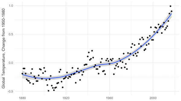
NASA yearly average temperatures and loess smoothed.

Three years above the trend is pretty common, but it makes you wonder: Do we know where the trend is? The convincing curve above is increasing at about 0.25°C per decade, but in the past 10 years, the temperature has increased by almost 0.5°C.

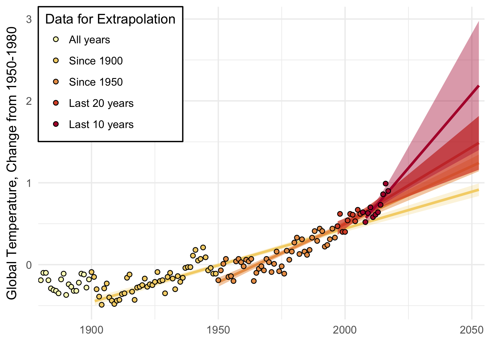
Depending on how far back you look, the more certain you are of the average trend, and the less certain of the recent trend. Back to 1900, we’ve been increasing at about 0.1°C per decade; in the past 20 years, about 0.2°C per decade; and an average of 0.4°C per decade in the past 10 years.

A little difference in the trend can make a big difference down the road. Take a look at where each of these get you, uncertainty included:

A big chunk of the fluctuations in temperature from year to year are actually predictable. They’re driven by cycles like ENSO and NAO. I used a nice data technique called “singular spectrum analysis” (SSA), which identifies the natural patterns in data by comparing a time-series to itself at all possible offsets. Then you can take extract the signal from the noise, as I do below. Black is the total timeseries, red is the main signal (the first two components of the SSA in this case), and green is the noise.

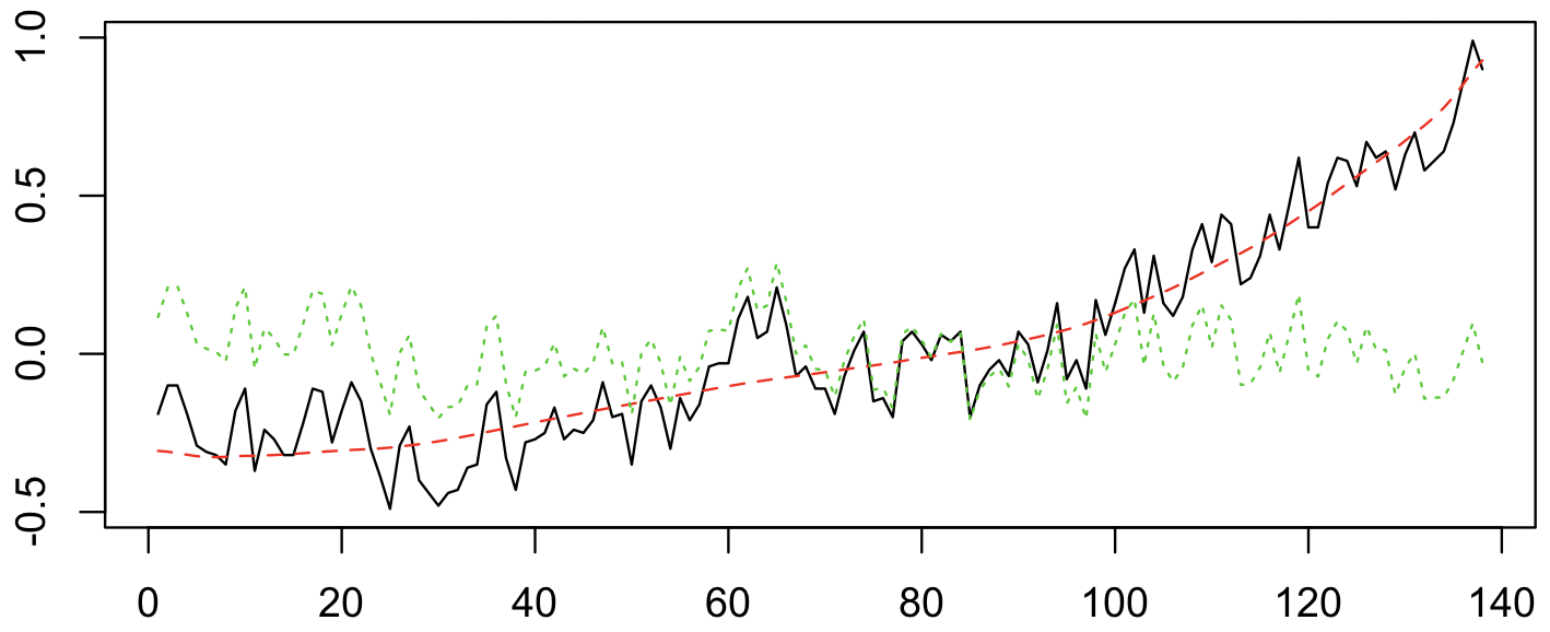
Once the noise is gone, we can look at what’s happening with the trend, on a year-by-year basis. Suddenly, the craziness of the past 5 years becomes clear:

It’s not just that the trend is higher. The trend is actually increasing, and fast! In 2010, temperatures were increasing at about 0.25°C per decade, an then that rate began to jump by almost 0.05°C per decade every year. The average from 2010 to 2017 is more like a trend that increases by 0.02°C per decade per year, but let’s look at where that takes us.

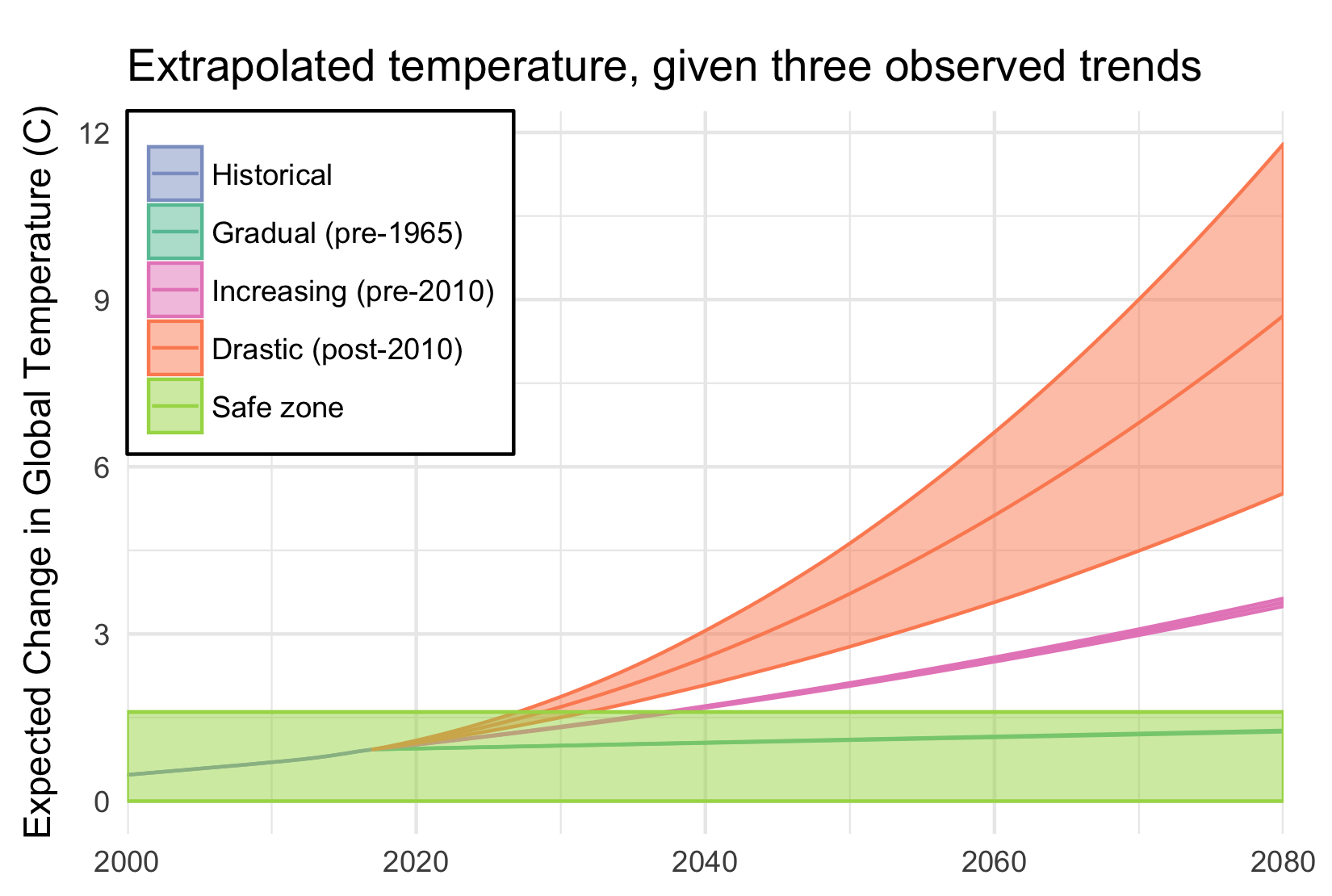
If that quadratic trend continues, we’ll blow through the “safe operating zone” of the Earth, the 2°C over pre-industrial temperatures, by 2030. Worse, by 2080, we risk a 9°C increase, with truly catastrophic consequences.

This is despite all of our recent efforts, securing an international agreement, ramping up renewable energy, and increasing energy efficiency. And therein lies the most worrying part of it all: if we are in a period of rapidly increasing temperatures, it might be because we have finally let the demon out, and the natural world is set to warm all on its own.

Categories: Data · Research

1 Million Years of Stream Flow Data

January 16, 2018 · Leave a Comment

The 9,322 gauges in the GAGES II database are picked for having over 20 years of reliable streamflow data from the USGS archives. Combined, these gauges represent over 400,000 years of data.
They offer a detailed sketch of water availability over the past century. But they miss the opportunity to describe a even fuller portrait.

In the AWASH model, we focus on not only gauged points within the river network and other water infrastructure like reservoirs and canals, but also on the interconnections between these nodes. When we connect gauge nodes into a network, we can infer something about the streamflows between them. In total, our US river network contains 22,619 nodes, most of which are ungauged.

We can use the models and the structure of the network to infer missing years, and flows for ungauged junctions. To do so, we create empirical models of the streamflows for any guages for which we have a complete set of gauged of upstream parents. The details of that, and the alternative models that we use for reservoirs, can be details for another post. For the other nodes, we look for structures like these:

Structures for which we can infer missing month values, where hollow nodes are ungauged and solid nodes are gauged.

If all upstream values are known, we can impute the downstream; if the downstream value is known and all but one upstream values are known, we can impute the remaining one; if upstream or downstream values can be imputed according to these rules, they may allow other values to be imputed using that new knowledge. Using these methods, we can impute an average of 44 years for ungauged flows, and an average 20 additional years for gauged flows. The result is 1,064,000 years of gauged or inferred streamflow data.

We have made this data available as a Zenodo dataset for wider use.

Categories: Data

Observations on US Migration

November 16, 2015 · Leave a Comment

The effects of climate change on migration are a… moving concern. The news usually go under the heading of climate refugees, like the devastated hoards emanating from Syria. But there is already a less conspicuous and more persistent flow of climate migrants: those driven by a million proximate causes related to temperature rise. These migrants are likely to ultimately represent a larger share of human loss, and produce a larger economic impact, than those with a clear crisis to flee.

In most parts of the world, we only have coarse information about where migrants move. The US census might not be representative of the rest of the world, but it’s a pool of light where we can look for our key. I matched up the ACS County-to-County Migration Data with my favorite set of county characteristics, the Area Health Resource Files from the US Department of Health and Human Services. I did not look at migration driven by temperature, because I wanted to know if some of the patterns we were seeing there were a reflection of anything more than the null hypothesis. Here’s what I found.

First, the distribution of the distance that people move is highly skewed. The median distance is about 500 km; the mean is almost 1000. Around 10% of movers don’t move more than 100 km; another 10% move more than 2500 km.

bydist

The differences between characteristics of the places where migrants are moving from and where they are moving to reveals an interesting fact: the US has approximate conservation of housing. The distribution of the ratio of incomes in the destination and origin counties is almost symmetric. For everyone who moves to a richer county, someone is abandoning that county for a poorer one. The same for the difference between the share of urban population in the destination and origin counties. These distributions are not perfectly symmetric though. On median, people move to counties 2.2% richer and 1.7% more urban.

byincome byurban

The urban share distribution tells us that most people move to a county that has about the same mix of rurality and urbanity as the one they came from. How does that stylized fact change depending on the backwardness of their origins?

urbancp-total

The flows in terms of people show the same symmetry as distribution. Note that the colors here are on a log scale, so the blue representing people moving from very rural areas to other very rural areas (lower left) is 0.4% of the light blue representing those moving from cities to cities. More patterns emerge when we condition on the flows coming out of each origin.

urbancp-normed

City dwellers are least willing to move to less-urban areas. However, people from completely rural counties (< 5% urban) are more likely to move to fully urban areas than those from 10 - 40% urban counties. How far are these people moving? Could the pattern of migrants' urbanization be a reflection of moving to nearby counties, which have fairly similar characteristics? urbandistcp

Just considering the pattern of counties (not their migrants) across different kinds degrees of urbanization, how similar are counties by distance? From the top row, on average, counties within 50 km of very urban counties are only slightly less urban, while those further out are much less urban. Counties near those with 20-40% urban populations are similar to their neighbors and to the national average. More rural areas tend to also be more rural than their neighbors.

What is surprising is that these facts are almost invariant across the distance considered. If anything, rural areas are *more* rural than their immediate neighbors than to counties further away.

So, at least in the US, even if people are inching their way spatially, they can quickly find themselves in the middle of a city. People don’t change the cultural characteristics of their surroundings (in terms of urbanization and income) much, but those it is again the suburbs that are stagnant, with rural people exchanging with big cities almost one-for-one.

Categories: Data · Research

Labor Day 2015: More hours for everyone

September 9, 2015 · Leave a Comment

In the spirit of Labor Day, I did a little research into Labor issues. I wanted to explore how much time people spent either at or in transit to work. Ever since the recession, it seems like we are asked to work longer and harder than ever before. I’m thinking particularly of my software colleagues who put in 60 hour weeks as a matter of course, and I wanted to know if it’s true across sectors. Has the relentless drive for efficiency in the US economy taken us back to the limit of work-life balance?

I headed to the IPUMS USA database and collected everything I could find on the real cost of work.

When you look at average family working hours (that is, including averaged with spouses for couples), there’s been a huge shift, from an average of 20-25 hours/week to 35-40. If those numbers seem low, note that this is divided across the entire year, including vacation days, and includes many people who are underemployed.

The graph below shows the shift, and that it’s not driven by specifically employees or the self-employed. The grey bands show one standard deviation, with a huge range that is even larger for the self-employed.

klass

So who has been caught up in this shift? Everyone, but some industries and occupations have seen their relative quality of life-balance shift quite a bit. The graph below shows a point for every occupation-and-industry combination that represents more than .1% of my sample.

hours

In 1960, you were best off as a manager in mining or construction; and worst as a laborer in the financial sector. While that laborer position has gotten much worse, it has been superseded in hours by at least two jobs: working in the military, and the manager position in mining that once looked so good. My friends in software are under the star symbols, putting in a few more hours than the average. Some of the laboring classes are doing relatively well, but still have 5 more hours of work a week than they did 40 years ago.

We are, all of us, more laborers now than we were 60 years ago. We struggle in our few remaining hours to maintain our lives, our relationships, and our humanity. The Capital class is living large, because the rest of us have little left to live.

Categories: Data

Tweets and Emotions

October 10, 2014 · Leave a Comment

This animation is dedicated to my advisor Upmanu Lall, who’s been so supportive of all my many projects, including this one! Prabhat Barnwal and I have been studying the effects of Hurricane Sandy on the New York area through the lens of twitter emotions, ever since we propitiously began collecting tweets a week before the storm emerged (see the working paper).

The animation shows every geolocated tweet in between October 20 and November 5, across much of the Northeastern seaboard– about 2 million tweets in total.

Each tweet is colored based on our term-usage analysis of its emotional content. The hue reflects happiness, varying from green (happy) to red (sad), greyer colors reflect a lack of authority, and darker colors reflect a lack of engagement. The hurricane, as a red circle, jutters through the bottom-left of the screen the night of Oct. 29.

The first thing to notice is how much more tweeting activity there is near the hurricane and the election. Look at the difference between seconds 22 (midnight on Oct. 25) and 40 (midnight on Oct. 30).

The night of the hurricane, the tweets edge toward pastel as people get excited. The green glow near NYC that each night finishes with becomes brighter, but the next morning the whole region turns red as people survey the disaster.

Categories: Data · Research

Grain-Weighted Elevation Map

March 9, 2014 · Leave a Comment

Elevation can be an important variable to consider, but the elevations represented in a digital elevation model (DEM) might not correspond very well to those that impact people. Agriculture can be a good proxy for where people are.

First, I generated a .5x.5 degree map of where grains are grown (barley, maize, millet, rice, sorghum, soybeans, and wheat). Then I used it to generate a .5x.5 degree DEM, based on GLOBE, where the elevation of each grid cell is a average of the elevations available in the finer resolution of GLOBE, weighted by the area of grains grown in the coarse pixel.

Here’s an image of the DEM. Download the 360×720 CSV.

avg_elev_50

Categories: Data · Research

Tools for Analyzing the EM-DAT Disaster Database

February 15, 2014 · Leave a Comment

The CRED EM-DAT database is a collection of information about disasters, which you can search and download. However, the form that its provided in can be inconvenient for immediate cross-country analysis. Here you can download it as a spreadsheet (along with the requisite agreement).

Given the unreliability of this data, sometimes the best analysis is the simplest. But I made three tools for some additional work. These are MATLAB functions, and the first step is to export a subset of the data as a csv, with the date columns formatted as numbers.

Simple plotting of EM-DAT totals (with running average): download zip

Plotting the probability of disasters of a given size: download zip

Attempt to find a power-law in disasters frequencies (changing in time): download zip

Categories: Data · Research

Land Area by Grid Cell

January 25, 2014 · Leave a Comment

I use global data along a latitude-longitude grid fairly frequently. That can distort land areas pretty severely, but often that’s not a problem, if the data in question doesn’t scale with land area. But when it does, you need a new denominator. Here’s a dataset for that case.

landarea

It’s a .5 degree gridded dataset of land areas. For grid cells that are completely on land, that’s just a function of the latitude. On the coasts, I use a higher-resolution map of the coast contour to figure out how much land is in each cell. The values fluctuate a little artificially, because of how everything is calculated, but it’s generally within 1% of the correct value.

Download it here: 720×360 CSV

Categories: Data

RAM Legacy Geography

January 22, 2014 · Leave a Comment

As part of my Marine Protected Area analysis, I constructed spatial boundaries for the data in the RAM Legacy database, a global database of stock assessments.

ramgeo

A dropbox with the spatial regions is available here:
The contents are as follows:
  • latlon.csv: The “raw” data, with an encoding of the polygons for each RAM region
  • reglocs.csv: Area and centroid location for each region
  • shapes/ram.*: A shapefile for the RAM regions (polygons map to lines in latlon.csv)
  • load_areas.R: A bunch of useful functions for interpreting the data in latlon.csv
  • genshape.R: The code that generated the shapefile from latlon.csv
  • From Boston Presentation.pdf: The relevant slides from the Boston presentation
  • fa_/ and kx-nz-fisheries-general-statistical-areas-SHP/: FAO and New Zealand fishing area shapefiles
I just generated the shapes/ram shapefile, and I haven’t figured out how to label each of the shapes its RAM region yet, so you just have to look in latlon.csv for the association.

A working paper of the project this was for is posted here: http://ssrn.com/abstract=2380445

The discussion of the geocoding of the RAM database is in the first appendix (which is just tacked on to the end of the paper).
You are welcome to use this data, but please cite that paper.

Categories: Data